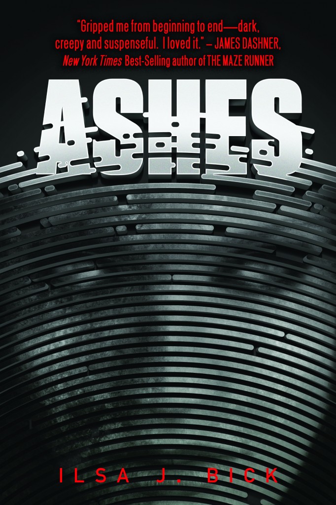
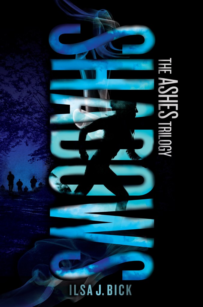
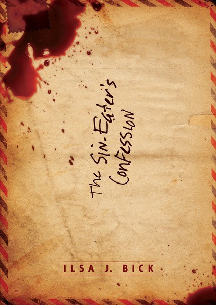
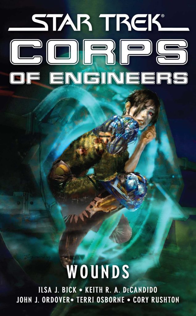
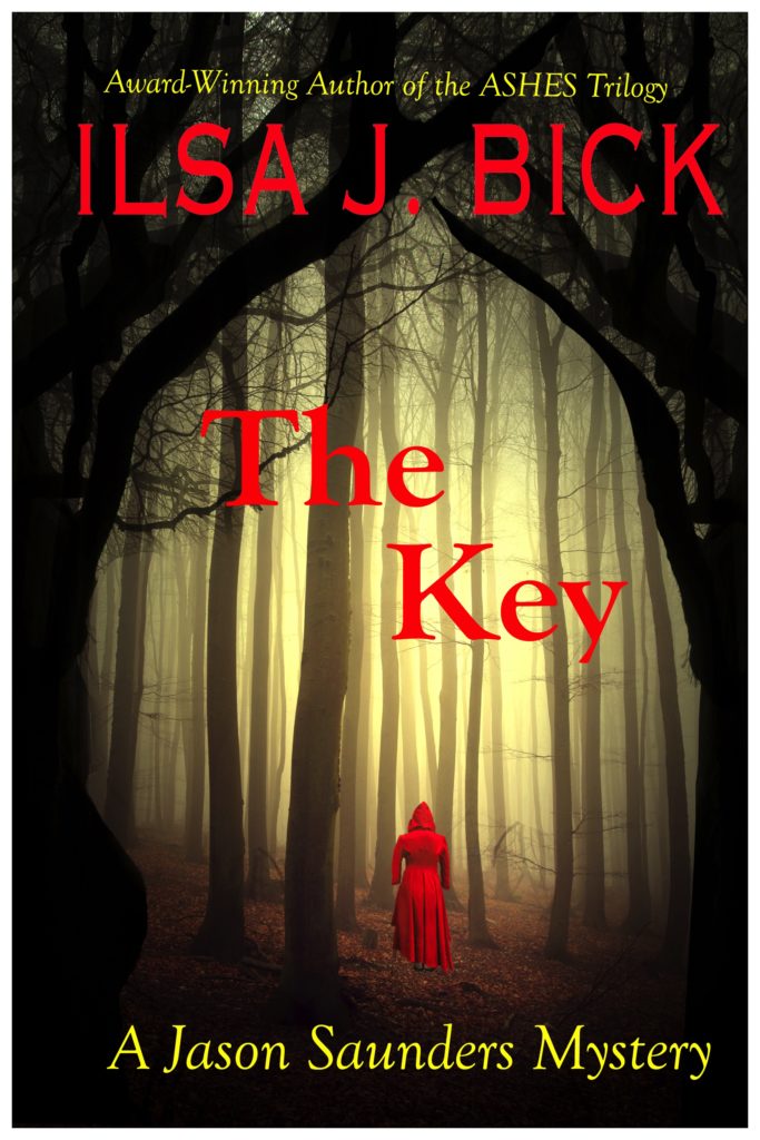
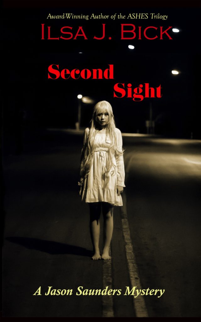
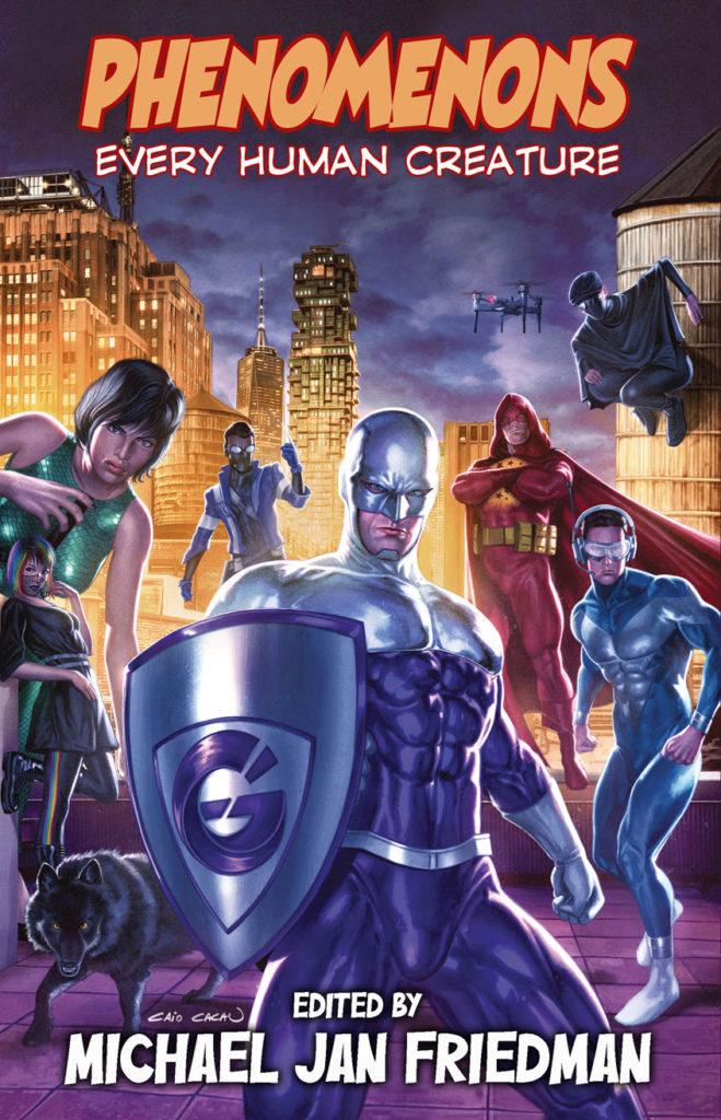
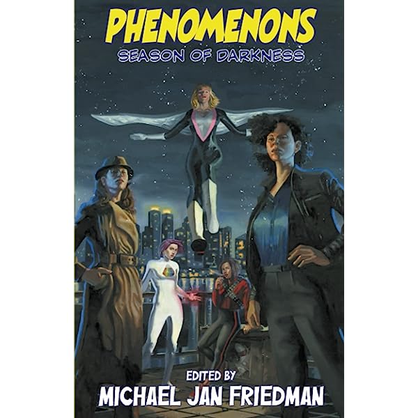
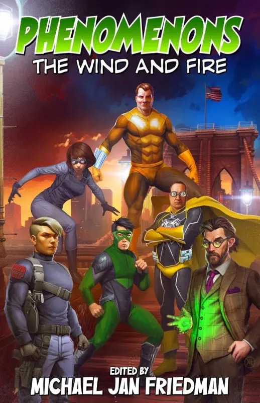
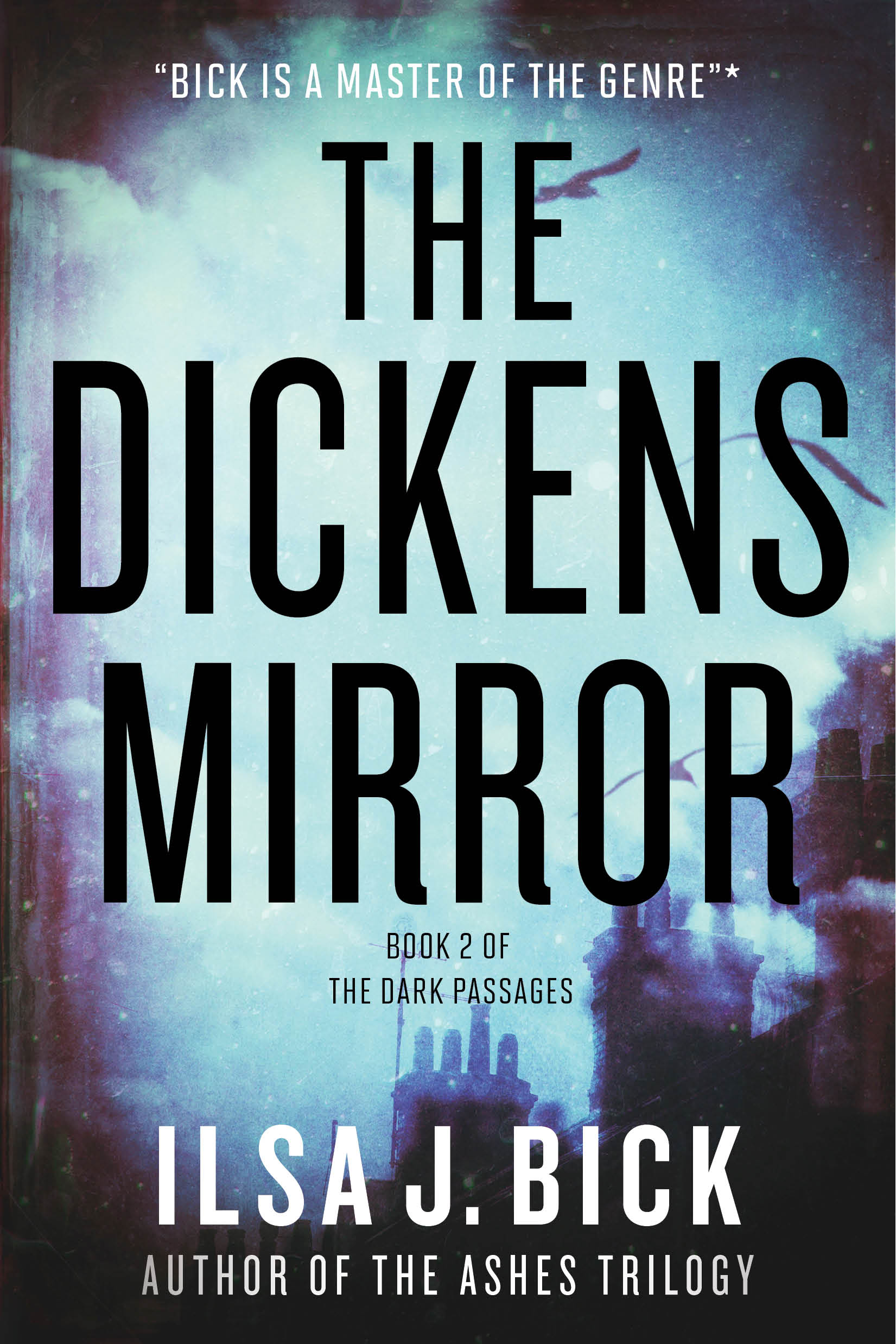
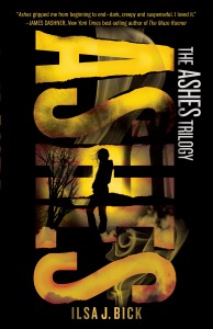
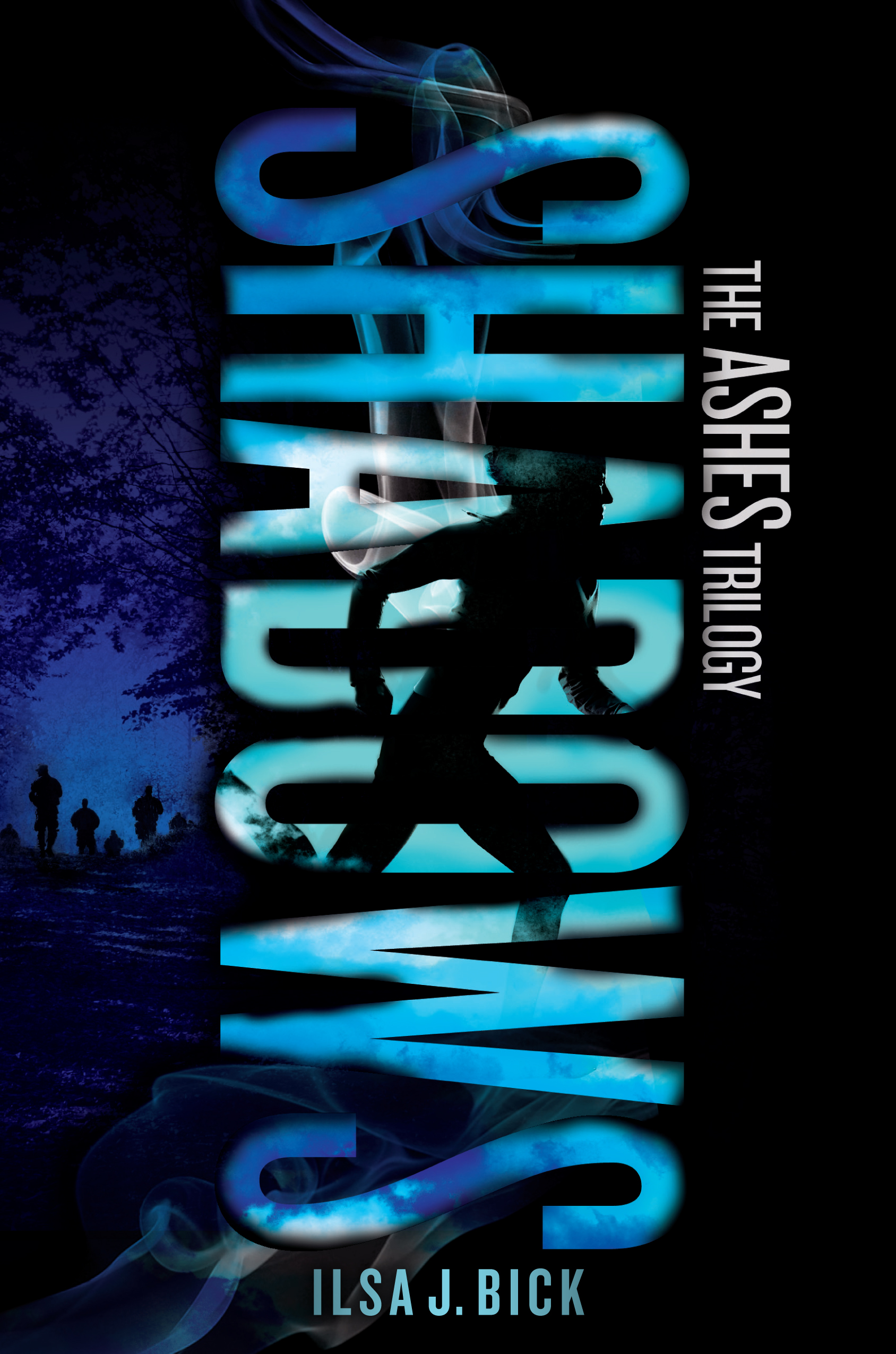
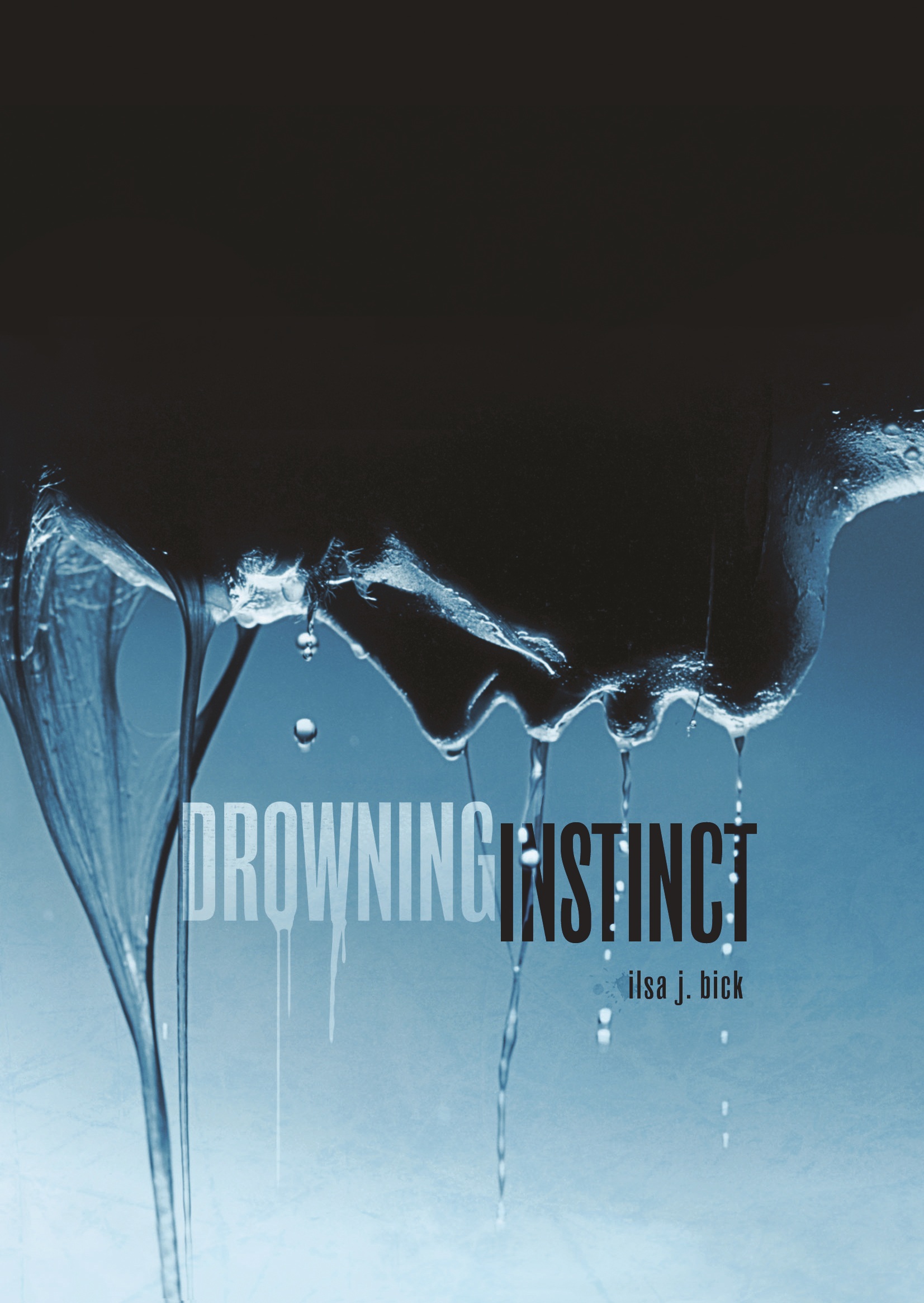
As you recall, two weeks ago I posted about an upcoming book whose cover seemed to take its cue from the ASHES series. This week, I’d intended to follow up with more examples of just how important a distinctive look is for any series author and talk, in very general terms, about branding, the importance of both establishing a series “look” as well as cueing readers to the genre in which a book falls–because we all know this, right? That covers follow genre conventions? Yes? Anyway, I had all these great covers for Lee Child’s Reacher series lined up–but then, Kristine Kathryn Rusch beat me to it. As always, her entire entry is worth reading; she covers not only this topic but the Patricia Cornwall court case; stats on kids’ reading habits (good news for both ebook and print devotees, and to which from my n of two kids, I can personally attest is absolutely true); and–one more time–the importance of sustained and determined effort to writerly success.
Kris’s comments and examples of branding follow her discussion of the Cornwall case, and to be honest . . . I really don’t have much to add. Clearly, her comments have more valence for those writers who are putting their own work out there, but I’ve certainly noticed how much the various overseas ASHES covers, which I posted about here, play into both a) prevalent trends in YA lit and b) romance conventions. Neither observation is surprising given that many YA readers are female. Anyway, the point is that if you’re going to put our your own stuff, creating a distinctive style–a cover signature as it were–while also cuing potential readers as to genre expectations will not only help your fans find you but also alert new readers about what to expect when they crack open or download that book. (Oh, and her point about the importance of interior design? Also worth reflection: I can’t tell you the number of times I’ve actually tried to read a particular book I would really LIKE to like–no, I won’t tell you which one–only to give up because the interior design makes the bloody thing unreadable. So not only will I probably never read it, I won’t recommend the book to anyone either.)
Anyway, like I said, hop on by Kris’s site; read what she has to say. All true, and if I were putting out my own books at the moment, I would seriously consider signing up for that online design course both she and her husband, Dean Wesley Smith, offer. Guys, you could do way, way worse. These people know their stuff.


