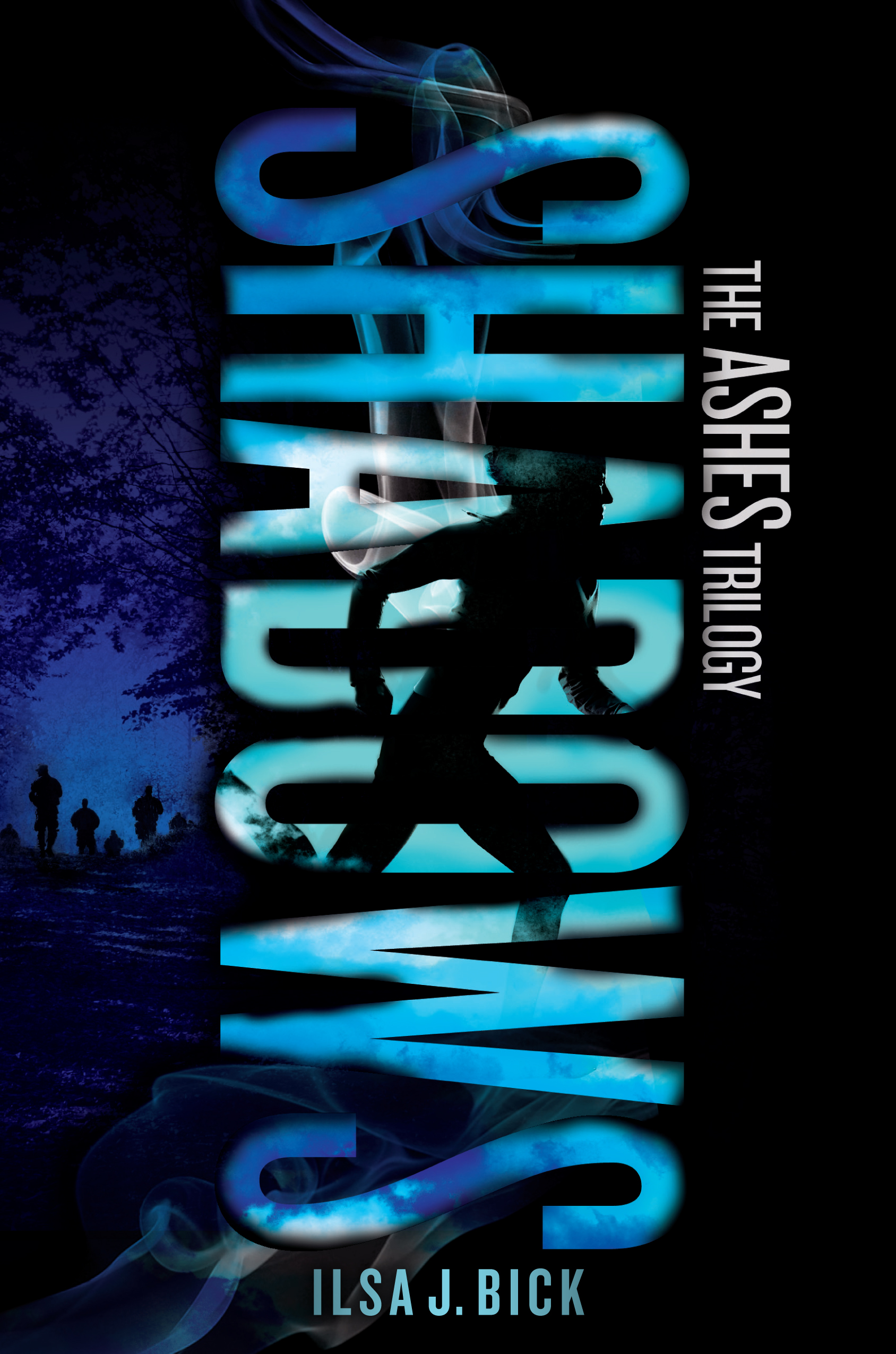
As I mentioned last week, yesterday Mundie Moms hosted an exclusive cover reveal for both the new ASHES paperback (coming in August) and SHADOWS (due out 9/25/12). The lead-up was great fun–lots of tweeting, FBing, excited fans–and now I get to share these covers with the whole wide world.
Be interested in what you think, too.
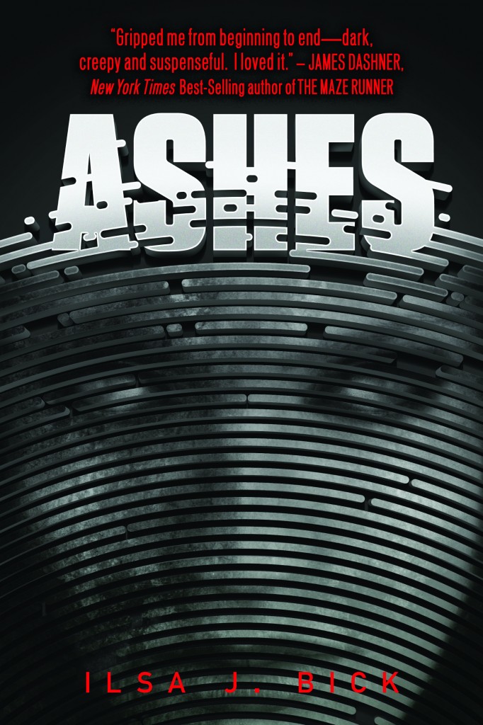
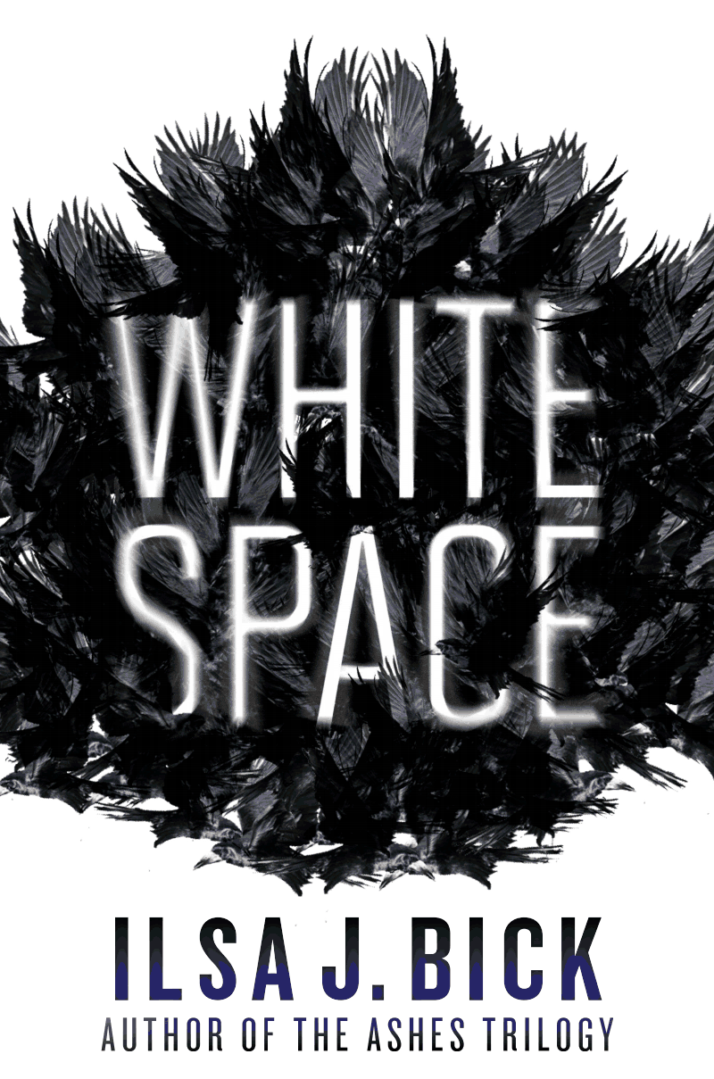
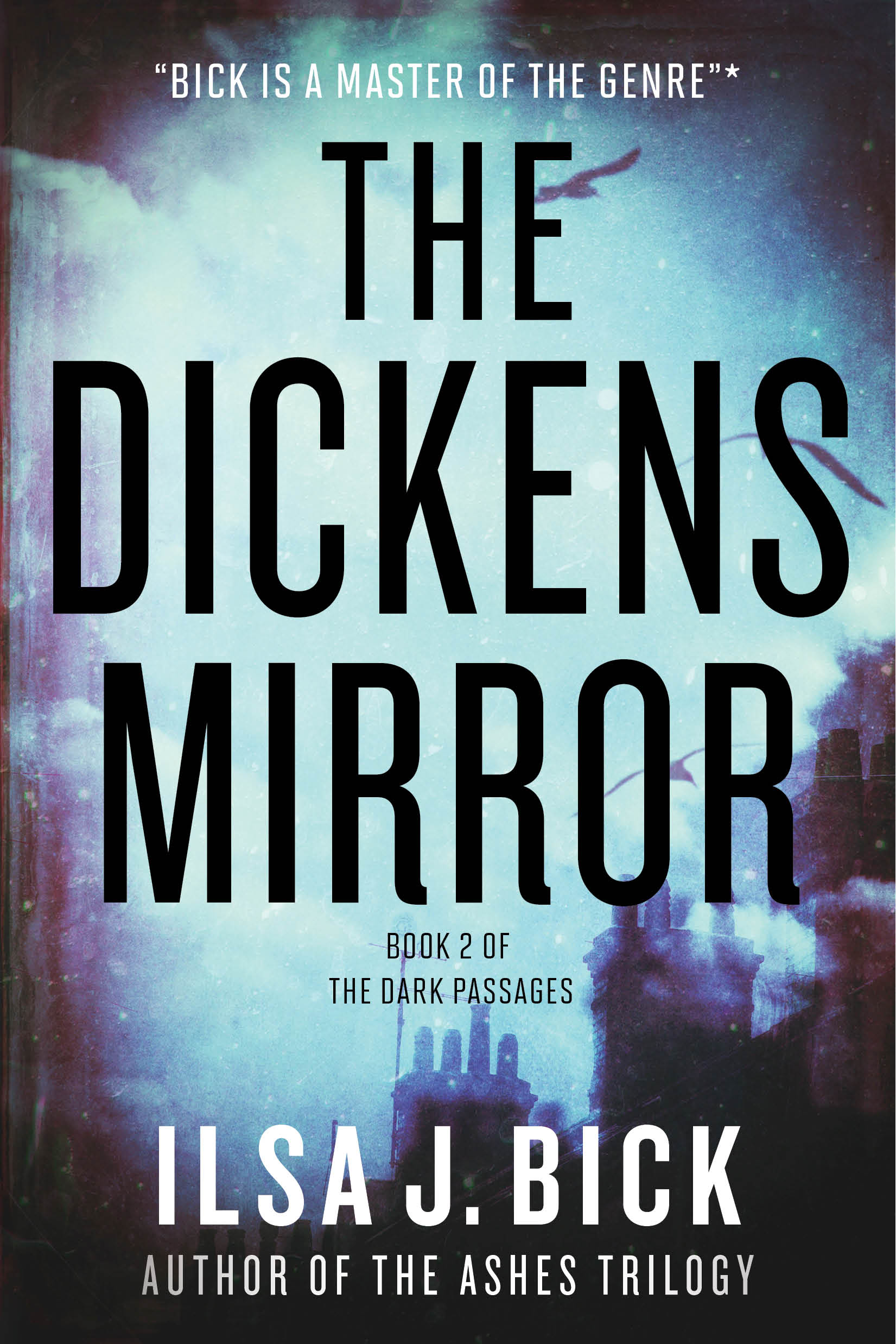
You remember the post I did about a month ago comparing the various treatments ASHES has gotten overseas? Well, take a peek at the old ASHES look
and now compare it to the new look ASHES will assume in paperback
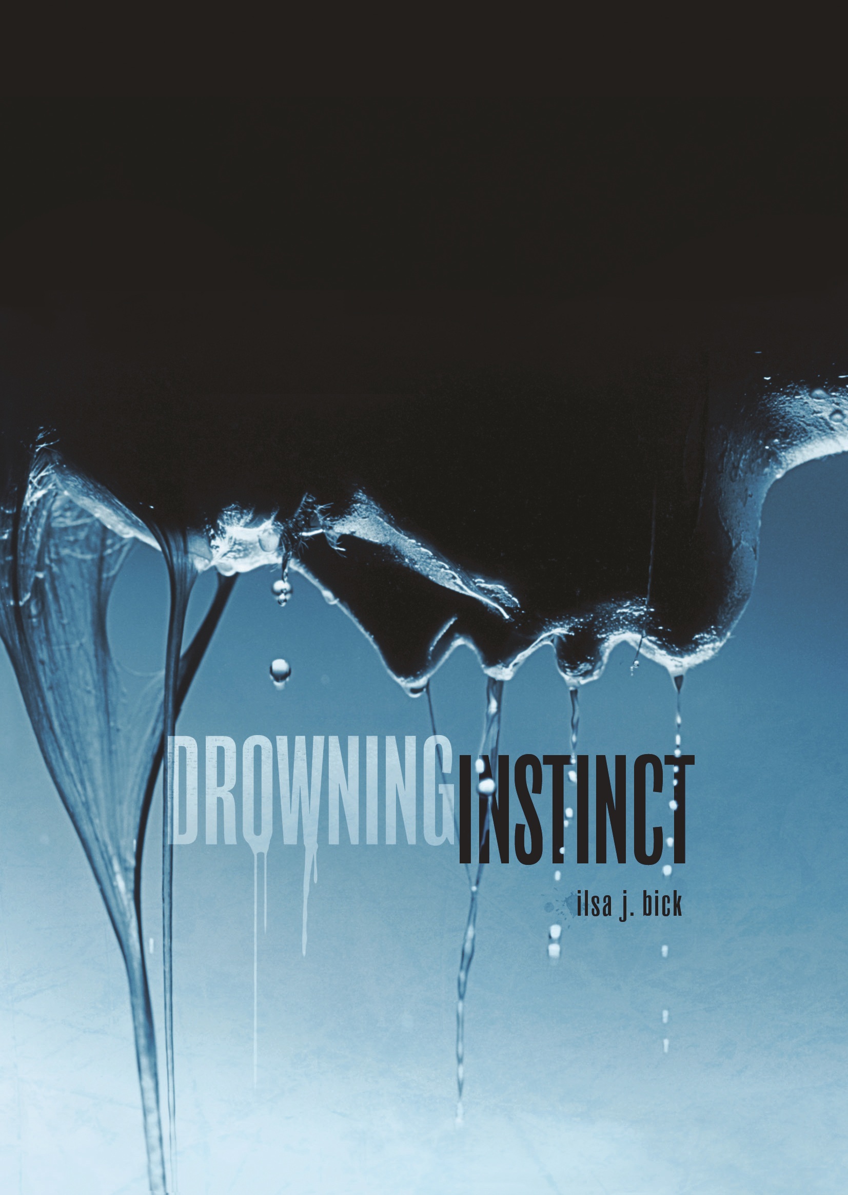
I’ll be honest. My first response was a Scooby-Doo uh-wuh? I’d grown very attached to my creepy-weird, gender neutral original cover. The new look felt . . . whoa, wait a second. I LIKED being creepy-weird, you know? But I DO remember that when I first that original cover, I’d been a little concerned about the lack of color. As it turned out, that was a legitimate concern. With the all-black/gray tones, the book got lost and easily overlooked. *I* missed it once because it was the last one on the shelf and, literally, in shadows/overshadowed by books on either side. So the addition of a little bit of color for that eye-pop is important from a purely grab-your-attention sense.
Most fans like the new direction. They really respond to the colors, like the air of mystery. Many, however, prefer the older, starker look. Both camps feel that each cover tells a different kind or piece of the story.
So what do you think? Does the new look speak to you? What kind of story does it promise? Are you intrigued? Indifferent? Turned off? What qualities in a cover appeal to you?/span>


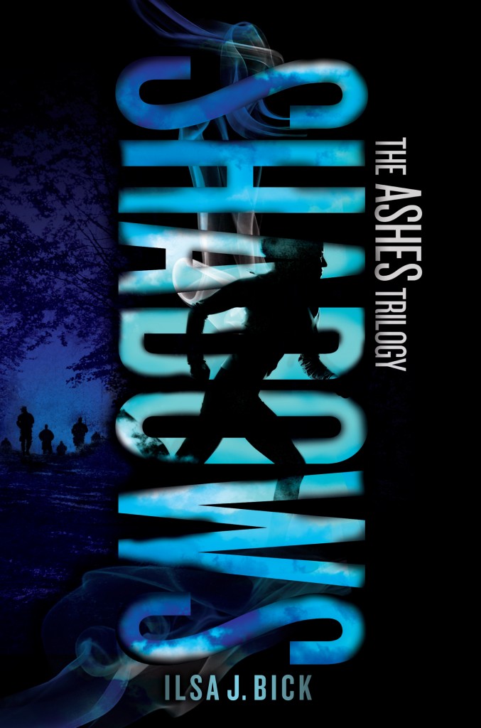
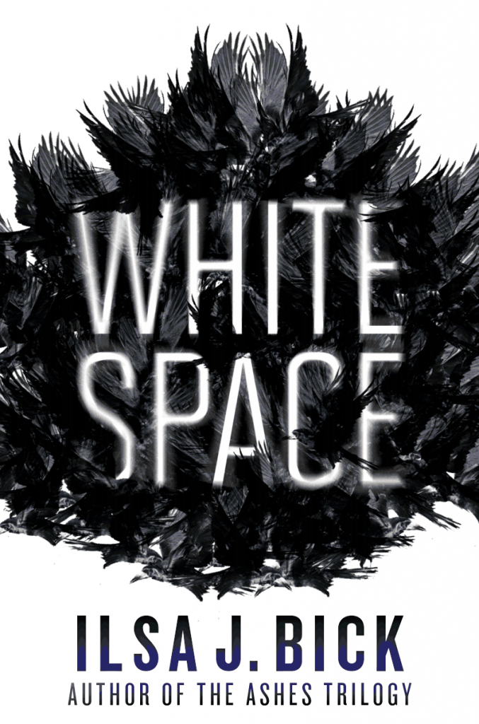

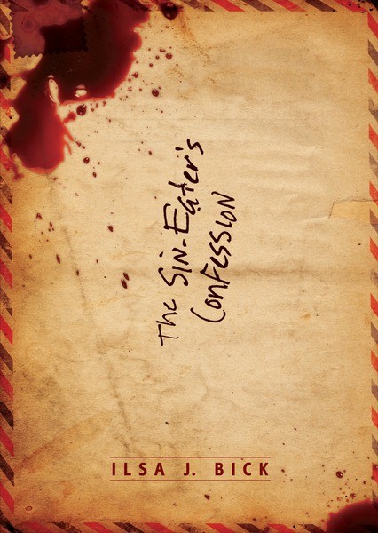



Though I did like the creepy aspect of the hardcover edition of Ashes, I love the new ones. My store got an ARC of Shadows and when I saw the cover I was hoping that it was going to be the official one and, ta-da, it is! And with the new cover for Ashes, I won’t have to bother putting it in anyone’s hands because it will already be in them. It just pops out at you waiting to be looked at. I also like that both covers are still ambiguous.
Congrats on the new covers!
Phew! Glad to hear you say that, Angie. I’ve been so ambivalent because I came to LOVE the old look so much. It’s singular and distinctive, but I also agree that while it might be something a tad more gender neutral, it might also drive away readers new to the series. I think the whole idea was to go for that pop–and it sounds like the designers succeeded 🙂
Hm, I really liked the old cover, but I agree that the new ones “pop out” more. I didn’t think of Scooby Doo until you said it, but yeah. LOL.
I actually ADORE this new look! The ARC copy I own also has a different look then the hardcover, and I was seriously attached to that one! I think the new covers really pop out at you and bring the story to a whole new level! I CANT wait to read Shadows!!! I LOVED Ashes to pieces (you know this) 😉
😀 I try for unique sound effects.
Oh, excellent. And, wow, Valia, you’re getting quite the collection, aren’t you? Old arc, hardcover, new paperback . . . you’re set for the apocalypse, that’s for sure.
And thanks 🙂
Hmmm… Looks like the designer went for a James Patterson, “Daniel X” look. I think it will appeal to a younger audience; middle school and up. They do stand out. Gotta say, I still love the mysterious and creepy hardcover version. But then, let’s not “judge a book by its cover.” The contents are extraordinary!
You are so sweet, Dayna. Personally, I LOVE my old cover.
I’m in favor of whichever cover sells the most books and enables you to keep turning out compelling stories. Are the ppb covers embossed like the hc dustcover was?
[FWIW, earlier this week I blogged about the effect Ashes had on me. It should be noted that I have kids who are in graduate school so I am not your average YA reader!]
Hey, Anne: You know, I’m don’t know. I would think/hope so, if only because that will help the titles stand out a bit more.
And thank you. I’m really glad the story got to you. Readers of all ages seem to enjoy my books, which is very gratifying. I think my oldest fan is 82 and the youngest is 12 or so. I also bopped over to your blog. That was a very nice post. Thank you for that.
Oh, and the reference to the movie of THE MIST? Right on. That’s an instance where the movie was actually better than the novella. (I had the same queasy feeling afterward. Reminded me a lot of Bradbury, actually: that ol’ pull the rug out from under feeling.)
Have a nice holiday.
I really love the original cover, and even had someone randomly single it out on my bookshelf recently because it stood out in stark contrast to the more colorful books around it. But maybe my friends just have an eye for dark books. (She loved it, BTW.)
The new version works because even though it is bright, it is still shadowy and mysterious. The dark places hint at danger lurking just out of sight. Is it September yet? O.O
I’m with you on that. But the new covers have their appeal, and the idea is to get the book into people’s hands. So . . . I’m happy for my work to be out there and I agree that the mysterious quality works. 🙂
September isn’t too far away now. Yikes! I guess I better write Book Three O.o
I love the old cover and the new one will take some getting used to. What really drew me in was the title. I saw it and thought “I wonder what thats about?” Then i read the synopsis and had to read the book. It was amazing and really makes you think. I can’t wait for the next one!!!!!!
Yes if you’ve been keeping track of my responses, I’m very on the fence about this. I have come to LOVE the old cover, but there is much about the new to admire. Glad you got curious 🙂
I loved Ashes. Just finished reading it, how ever I live in Australia and I have a completely different cover, it’s a wonderful golden and black face. Quite striking and it definitely stood out while still being simplistic.
Very nice
Ah, yes, that IS a beautiful cover! Wait until you see the SHADOWS cover. Also *quite* beautiful. Pleased you enjoyed the read, too 🙂
The cover makes no difference to me, I just want what’s inside! My students and I are just dying for the next book! A synopsis or something to tie us over?
LOL! 😀 I’m afraid the only synopsis I can give you is this: things get worse.
Much, much worse.
😉
I really like the covers!!! Here is a voice from the past hu? I hope things are going well with you. Take care.
Wow, I’ll say. Long time, no ecoutez! I was just thinking about you the other day, wondering where you’d got yourself to. So, nu? Things going well?
I always thought the last one was awesome! The creepy-cool cover actually attracted me to read it. And hey, it was one of the awesomest books ever. Trying to get ahold of Shadows now 😀
I guess if majority of people like the new cover better, I guess it’s better. The people on the covers really do show a cool magnetizng kind of mystery~
I’m with you, Afroza, but I do understand the reasons for the changes, and I DO like the SHADOWS cover quite a bit, especially the colors. SHADOWS isn’t yet available, though; although you can pre-order, the book comes out on 9/25/12.
i loved the book ashes, the end almost killed me. i was thrilled to learn of the upcoming sequal.
Glad to hear it! 😀
I thought the first cover popped, just because it was so different, but that’s just me personally. I thought with the title “Ashes” the book being black/grey before I even read it, I thought that was kind of cool. But after looking at the new cover and the cover for Shadows, I think they are just as cool. The color does pop out at you, and with the blue being so bright, the shadows of the people on the cover really stick out which is perfect because of the title.
Well, that was a very even-handed reply, Bridgette 🙂 I really loved the first cover, but I also wondered what they could do for the second to expand on that theme–and figured they probably couldn’t. So I think they went for something that would be distinctive while not fading into the shelves (a huge problem when your book is predominantly black; you really can’t see it well).
Take a look at the UK covers, too. SHADOWS is very good, and–of course–I’m VERY partial to all that lurid red for the Spanish edition.
I just finished listening to Ashes. I was so upset at how it ended…I felt like I was just dropped. And then I found this website and realized it was Book ONE. That wasn’t on the cover, and I didn’t know it was one of 3. So you are off the hook! I did enjoy it (until the last chapter!) and loved the premise…one I have thought about.
Thank you. Keep it up. ANd I hope to heck our library has the next 2 books!!!
Hey, Wanda: Yeah, I broke a couple rules there, didn’t I? 😉 Your reaction’s not uncommon, but I’m glad you figured out that there’s more to come. Wasn’t Katy Kellgren great? Such a wonderful facility with voices. Anyway, I’m with you: it’s a great listen.
Now…go badger your librarian. 😉